AutoComplete
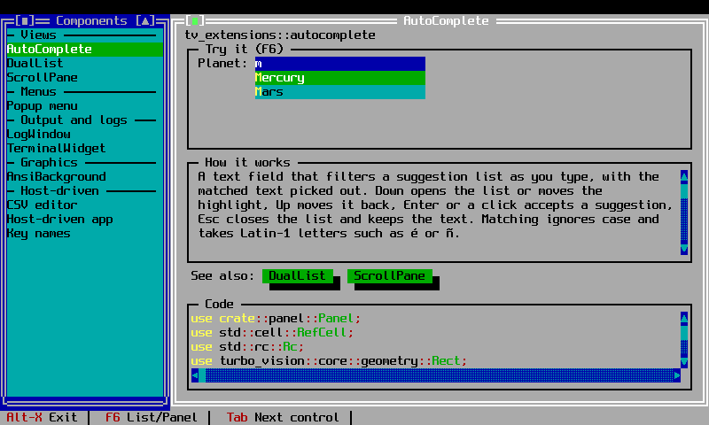
AutoComplete is a text field that filters a suggestion list as you type,
like the typeahead fields of web toolkits. Once enough characters are typed,
a list of the items containing them opens under the field, with the matched
text in its own colour. It is always available, with no feature flag.
Validation rules
Two independent rules decide what the field accepts when a dialog's OK (or
Enter) asks it, through the dialog's valid() check. Both are off by
default:
required(true): the field may not be blank.require_match(true): text that is not blank must be one of the items, ignoring case. This is Borland'sTStringLookupValidator.
required |
require_match |
Blank | Text not in the list | An item | Typical use |
|---|---|---|---|---|---|
| no | no | ok | ok | ok | Search boxes, notes: anything open-ended |
| yes | no | refused | ok | ok | A name that must be given; the list only suggests |
| no | yes | ok | refused | ok | An optional choice from a fixed set |
| yes | yes | refused | refused | ok | A choice that must be made from a fixed set |
Free text (no rules)
The default. The list is a convenience: the user can pick a suggestion, type anything else, or leave the field blank.
use std::{cell::RefCell, rc::Rc};
use turbo_vision::core::geometry::Rect;
use tv_extensions::AutoCompleteBuilder;

let notes = Rc::new(RefCell::new(String::new()));
let field = AutoCompleteBuilder::new()
    .bounds(Rect::new(12, 3, 42, 4))
    .items(["Gift wrap", "Leave at the door", "Call on arrival"])
    .data(notes.clone())
    .build();
// After the dialog closes, `notes` holds whatever was typed or picked.
Required
Anything but blank. The suggestions still only suggest.
use std::{cell::RefCell, rc::Rc};
use turbo_vision::core::geometry::Rect;
use tv_extensions::AutoCompleteBuilder;

let city = Rc::new(RefCell::new(String::new()));
let field = AutoCompleteBuilder::new()
    .bounds(Rect::new(12, 3, 42, 4))
    .items(["Barcelona", "Madrid", "Palma"])
    .data(city.clone())
    .required(true)
    .build();
// After OK, `city` is not blank.
From the list, optional
Blank is allowed; anything typed must be one of the items.
use std::{cell::RefCell, rc::Rc};
use turbo_vision::core::geometry::Rect;
use tv_extensions::AutoCompleteBuilder;

let fruit = Rc::new(RefCell::new(String::new()));
let field = AutoCompleteBuilder::new()
    .bounds(Rect::new(12, 3, 42, 4))
    .items(["Apple", "Banana", "Cherry"])
    .data(fruit.clone())
    .require_match(true)
    .build();
// After OK, `fruit` is blank or one of the items.
From the list, required
A value must be chosen from the items.
use std::{cell::RefCell, rc::Rc};
use turbo_vision::core::geometry::Rect;
use tv_extensions::AutoCompleteBuilder;

let country = Rc::new(RefCell::new(String::new()));
let field = AutoCompleteBuilder::new()
    .bounds(Rect::new(12, 3, 42, 4))
    .items(["Austria", "Australia", "México"])
    .data(country.clone())
    .required(true)
    .require_match(true)
    .required_message("Choose a country")
    .match_message("Choose a country from the list")
    .build();
// After OK, `country` is one of the items.
The same switches exist on the view itself: set_required and
set_require_match.
When a value is refused
- The dialog stays open, and the field shows an error line under itself in
Borland's error colours (white on light red): "A value is required" for a
blank required field, "Choose a value from the list" for text that is not
an item.
required_messageandmatch_messagechange them; they are cut to the field's width. - The line stays until the user edits the field or picks a suggestion. For text that is not an item, the list also opens on the closest matches when the field has the focus.
- As in any Turbo Vision dialog, OK checks the fields in order and stops at the first that refuses. A second faulty field reports on the next OK.
- Cancel always closes.
Unknown text is left as typed, so the user sees what to fix. Leaving a field
that must match (Tab, or a click elsewhere) only fixes the spelling of a
match: méxico becomes México.
Borland's validators report with a message box. Here valid() has no access
to the application to run one (core's own validators leave their error()
empty for that reason), so the field shows the error itself; being part of
the field, it stays visible while the focus is on the OK button.
Keys and mouse
| Key | Action |
|---|---|
| Printable characters (ASCII and Latin-1) | Type into the field, filter the list |
| Down | Open the list, or move the highlight down |
| Up | Move the highlight up |
| Enter | Accept the highlighted suggestion; with the list closed, the dialog's default button |
| Esc | Close the list without changing the text; with the list closed, the dialog's handling |
| Left/Right/Home/End/Backspace/Delete | Ordinary text editing |
Clicking a suggestion accepts it, and clicking the field opens the list.
Matching ignores case, including accented Latin-1 letters such as é or
ñ; characters beyond Latin-1 cannot be typed, since turbo-vision's key
codes cannot tell them from special keys.
Layout and colours
Give the field a one-row bounds. While the error line or the list is
showing, the view's bounds grow downward over them, so the owning group draws it and sends clicks on it to
the field; they shrink back when it closes. Leave room below the field for
the list (max_drop_rows, default 6), or add the field after any control the
list may open over, since children are drawn and hit-tested in the order they
were added.
Colours come from the owner's palette, like core's controls: the field uses the input-line entries; the list uses the list-box entries in a dialog and the window's own text colours in a window.
Options
| Builder | Setter | Default | Meaning |
|---|---|---|---|
items |
set_items |
empty | The suggestions |
data |
— | a new empty string | The shared Rc<RefCell<String>> holding the text |
required |
set_required |
false |
May the field be blank? |
require_match |
set_require_match |
false |
Must text that is not blank be one of the items? |
required_message |
set_required_message |
"A value is required" | The error line for a blank required field |
match_message |
set_match_message |
"Choose a value from the list" | The error line for text that is not an item |
min_chars |
set_min_chars |
1 | Characters typed before the list opens; 0 opens it on any edit |
max_drop_rows |
set_max_drop_rows |
6 | Rows shown before the list scrolls |
max_length |
set_max_length |
255 | Longest text accepted |
on_select |
set_on_select |
0 (none) | Command broadcast when a suggestion is accepted |
Example
examples/autocomplete.rs has one field per combination that adds a rule:
Country (required, from the list), Fruit (optional, from the list) and City
(required, free text). Press OK with them blank or holding text that is not
listed to see each error line; fix the field and press OK again.